I was listening to Frank Harrell on the Plenary Sessions podcast talk about Bayesian methods applied to clinical trials. I’d recommend anyone interested in or considering applying Bayesian methods listen to the episode.
One thing I liked was their discussion on communicating the evidence for practical significance in a transparent way. They were talking about how a paper they had read had a very good example of this. The episode doesn’t have notes so I did not see the paper.1 But I understood the basic idea to be that you can calculate and report the probability that the treatment effect exceeds all relevant values of practical significance.
I’ll go through an example to demonstrate this. The data are Kruschke’s hypothetical IQ data from his BEST paper.2 The green points are from the control group (placebo) and the red points are from the treatment group who received a “smart” drug:
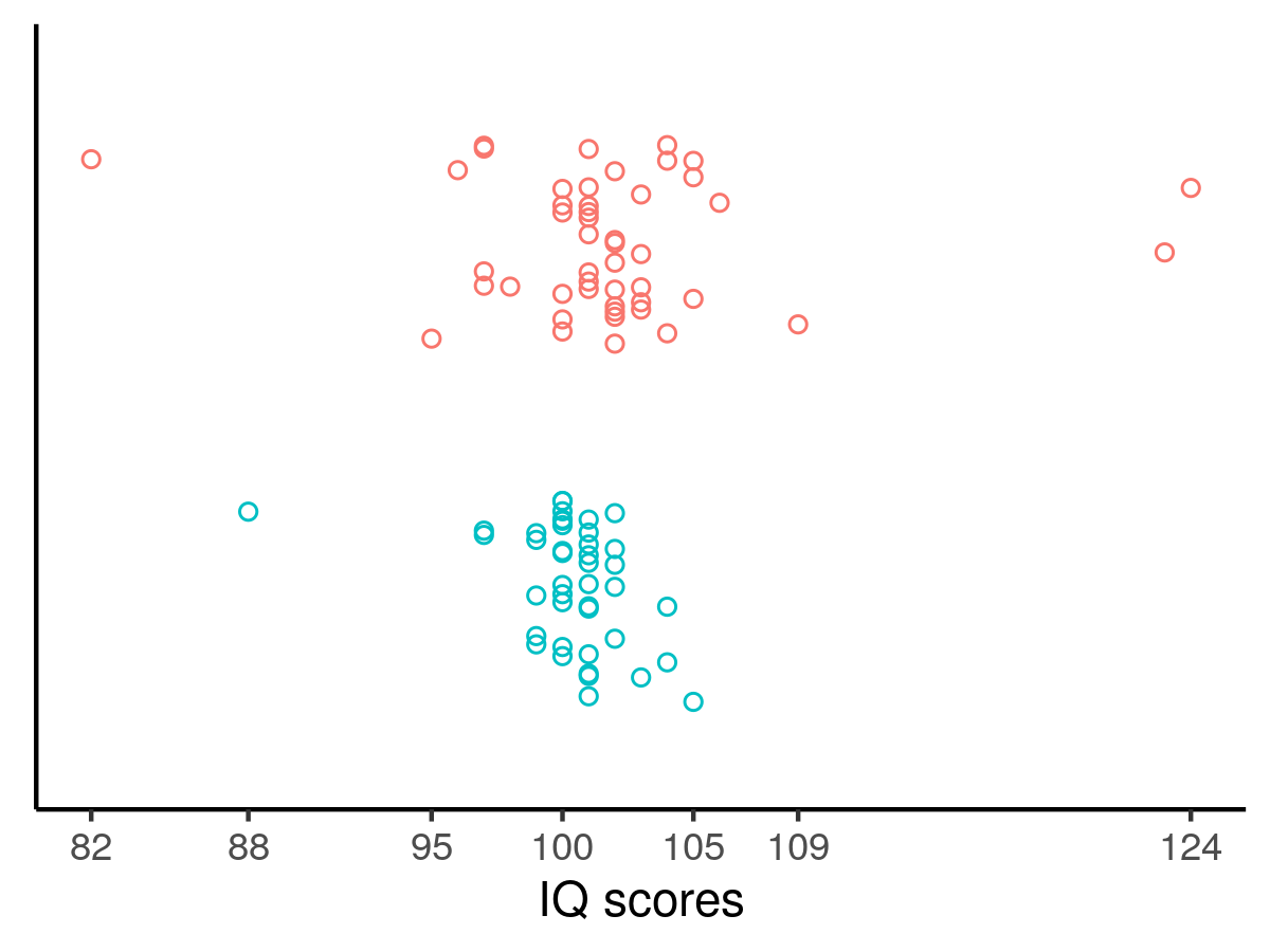
Kruschke performed a Bayesian analysis, assumed the data were t-distributed which accommodated outliers in the data and permitted the data to be heteroskedastic by group membership. The results suggested a very high probability that the treatment effect exceeded zero. Following Harrell’s advice, one could go further and produce the following graph:
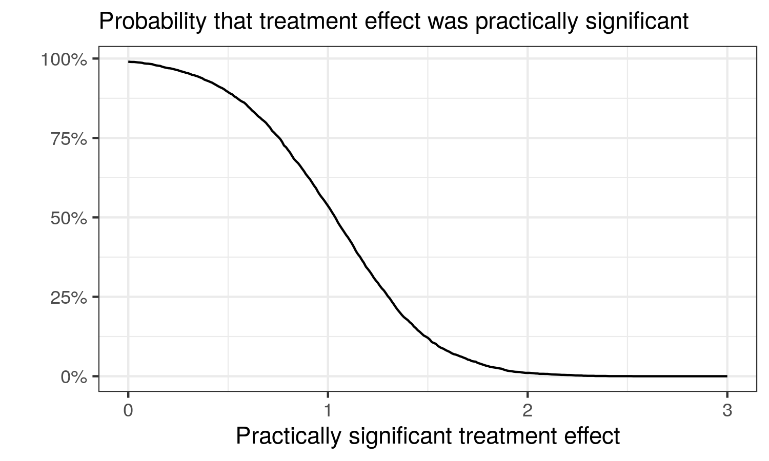
Given this graph, the probability that the treatment improved IQ by more than 1 point was barely over 50%. If we consider a 3-point IQ increase the minimum that is worth paying attention to, then the probability that the smart drug improved IQ points by a value that was of importance was 0. 2 points? Barely above 0. If we set ourselves the low bar of any kind of improvement i.e. more than 0 points, the probability that the smart drug worked was almost 100%.
If researchers stop at the low bar of any kind of improvement, the almost 100% probability of efficacy is very impressive. However, consider any useful level of practical significance and the probability of practical significance plummets. Researchers can produce this type of graph for any effect or relation that is of interest, and the graph provides a transparent way for readers to assess the effect/relation. Some readers have high standards, others have low standards. Given sufficient familiarity with the scale of the effect size, different readers can come to different evaluations given the transparent reporting.
I did not run Kruschke’s exact model. The model I ran was:
$$\mathbf y \sim t\big(\nu, \beta_0 + \beta_1\times\mathbf x, \exp(\theta_0 + \theta_1\times \mathbf x)\big)$$
$$\nu \sim \mathrm{gamma}(2, 0.1),\quad \beta_0 \sim \mathrm{Cauchy}(0, 5),\quad \beta_1 \sim \mathcal{N}(0, 15 / 1.96)$$
$$\theta_0 \sim t(3, 0, 1),\quad \theta_1\sim \mathcal{N}(0, \ln(3) / 1.96)$$
where \(\mathbf y\) was the outcome variable and \(\mathbf x\) was the treatment indicator. And I calculated the probability that \(\beta_1>\text{effect}\) for different values of the effect using the posterior values of \(\beta_1\).
The code is available here:
-
I later found the paper after writing this blog post, see Figure 3 in the paper: https://doi.org/10.1136/bmjopen-2018-024256 ↩︎
-
Kruschke, J. K. (2013). Bayesian estimation supersedes the t test. Journal of Experimental Psychology: General, 142(2), 573–603. https://doi.org/10.1037/a0029146 ↩︎
Comments powered by Talkyard.